Data visualization is the discipline of trying to understand data by placing it in a visual context so that patterns, trends
Python is blessed with some good libraries for visualizations.
Open Jupyter notebook or any other IDE of your preference.
Library to use – There are
So
Importing the library and giving it the standard alias as
Following are the two important functions which will come
handy in this book:-
To display a chart you should use – plt.show()
To save the chart as an image, use the code – plt.savefig(“Filename.png”)
Popular plotting libraries in Python are:-
1. Matplotlib – Best to start with.
It provides easy implementation and gives a lot of freedom
2. Seaborn – It has a high level
interface and great default styles
3. Plotly – To create interactive
plots
4. Pandas Visualization – Easy
interface, built on Matplotlib
Line Chart
A line chart or line graph is a type of chart which displays information as a series of data points called ‘markers’ connected by straight line segments.
So, a line plot is a very basic plot which is used to show observations collected after a regular interval. The x-axis represents the interval and the y-axis represents the values.
Lets plot our first graph
import matplotlib.pyplot as plt
x = [1,2,3,4,5,6]
y = [10,12,20,21,30,35]
plt.plot(x,y)
Here is what you will get
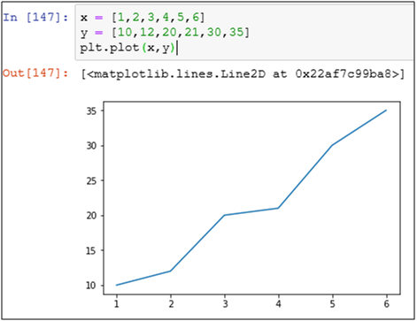
Graph 1 – Basic Line Chart
Plot a sin graph using
import matplotlib.pyplot as
from
x = [x*0.01 for x in range(100)]
y = cos(x)
plt.plot(x,y)
plt.show()
Here is what you get as a cos graph
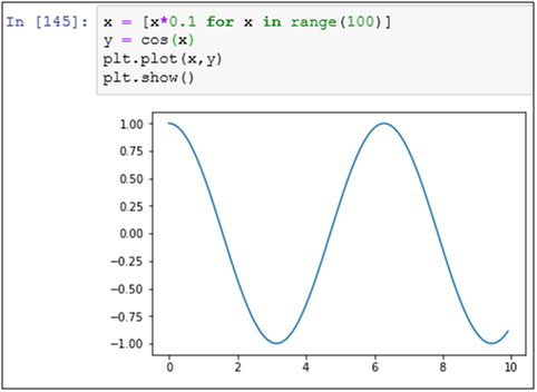
Graph 2 – Cos graph using line plot
You know how to plot a line graph, but there is one important thing missing in the graph i.e. the x and y-axis, and the plot title. Let’s create another line plot for
c = [1,2,3,4,5,6]
student = [40,52,50,61,70,78]
Following commands are used to put x-axis label, y-axis label, and chart title
plt.xlabel(“Label”)
plt.ylabel(“Label”)
plt.title(“Title”)
The code is given below
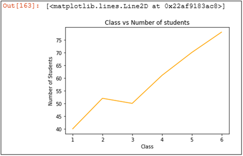
c = [1,2,3,4,5,6]
student = [40,52,50,61,70,78]
plt.xlabel(“Class”)
plt.ylabel(“Number of Students”)
plt.title(“Class vs Number of students”)
plt.plot(c, student)
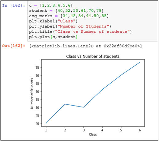
Graph 3 – Class vs Number of Students chart with proper labels and plot title
Do you want to change the color of the line?
Try the following code instead to make the line green in color
plt.plot(c
Graph 4 – Adding color to the same graph
You can also add multiple plots in the same graph. Let’s try to put a couple of new lines in the graph i.e. number of teachers and average marks
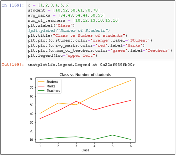
Graph 5 – Adding multiple lines to a graph
To add a legend, you have to give
The
code is self explanatory and is given below:-
c = [1,2,3,4,5,6]
student = [40,52,50,61,70,78]
avg_marks = [34,43,54,44,50,55]
num_of_teachers = [10,12,13,10,15,10]
plt.xlabel(“Class”)
#plt.ylabel(“Number of Students”)
plt.title(“Class vs Number of students”)
plt.plot(c,student,color=’orange’,label=’Student’)
plt.plot(c,avg_marks,color=’red’,label=’Marks’)
plt.plot(c,num_of_teachers,color=’green’,label=’Teachers’)
plt.legend(loc=”upper left”)
Bar Chart
“A bar chart or bar graph is a chart or graph that presents categorical data with rectangular bars with heights or lengths proportional to the values that they represent. The bars can be plotted vertically or horizontally.”
After the line chart, the second basic but
To create a bar chart – plt.bar(x,y)
We will plot
import matplotlib.pyplot as plt
a = [‘Apple’,’Mango’,’Pineapple’]
b = [40,60,50]
plt.bar(a,b)
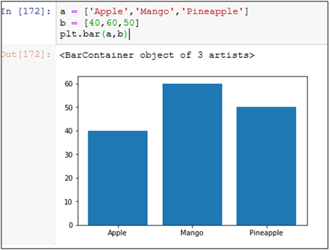
Graph 6 – A simple bar chart
Use random values between 1 and 100 to create the same graph.
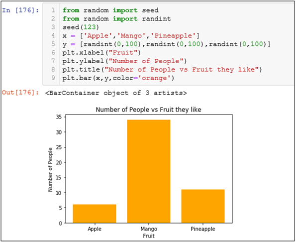
import matplotlib.pyplot as plt
from random import seed
from random import randint
seed(123)
x = [‘Apple’,’Mango’,’Pineapple’]
y = [randint(0,100),randint(0,100),randint(0,100)]
plt.bar(x,y)
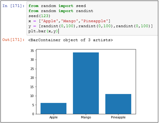
Graph 7 – Bar chart with random values
Adding color, labels, and title to the random values bar chart
Stacked 100% bar chart with
When you have to show components of components like the graph below
Example of 100% bar chart
x =
[“a”,”b”,”c”,”d”]
y1 = np.array([3,8,6,4])
y2 = np.array([10,2,4,3])
y3 = np.array([5,6,2,5])
snum = y1+y2+y3
# normalization
y1 = y1/snum*100.
y2 = y2/snum*100.
y3 = y3/snum*100.
plt.figure(figsize=(4,3))
# stack bars
plt.bar(x, y1, label=’y1′)
plt.bar(x, y2 ,bottom=y1,label=’y2′)
plt.bar(x, y3 ,bottom=y1+y2,label=’y3′)
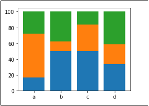
Graph 8 – A 100% stacked bar chart
Histogram
Histograms are density estimates. A density estimate gives a good impression of the distribution of the data. The idea is to locally represent the data density by counting the number of observations in a sequence of consecutive intervals (bins).
To plot a histogram use this code –
A simple histogram plot
q = [1,2,34,5,44,66,66,90,33,45,2,1,2,3,4]
plt.hist(q,bins = 3,color=’green’)
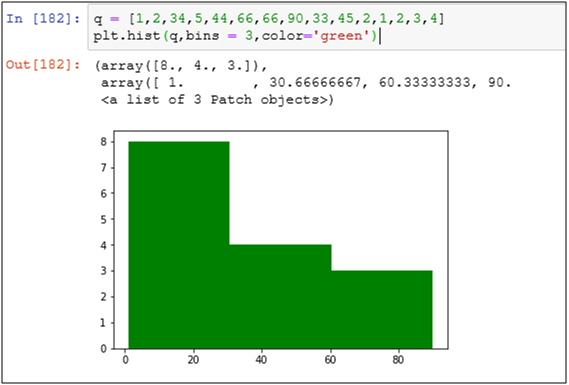
Graph 9 – A simple histogram
Create a list using random variables and plot it in 4 bins
import random
my_rand = random.sample(range(1,30),20)
print(my_rand)
print(type(my_rand))
plt.hist(my_rand,bins=4,color=’orange’)
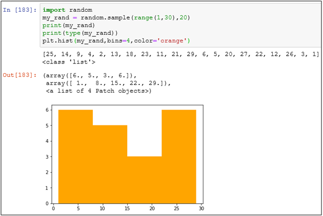
Graph 10 – A histogram made with random variables
In Histogram also you can add more than one data points to make parallel bars.
import random
my_rand = random.sample(range(1,30),20)
my_rand2 = random.sample(range(1,25),20)
print(my_rand)
print(type(my_rand))
plt.hist([my_rand,my_rand2],bins=4,color=[‘green’,’red’])
legend = [‘Rand1′,’Rand2’]
plt.legend(legend)
plt.xlabel(“Bins”)
plt.ylabel(“Random Number”)
plt.title(“Random Variable distribution”)
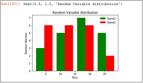
Graph 11 – Parallel histogram
Horizontal Histogram
import numpy as np
import matplotlib.pyplot as plt
name = [‘Nitin’,’Saurabh’,’Rahul’,’Gaurav’,’Amit’]
run = [200,70,130,120,100]
plt.barh(name,run,color=’orange’)
plt.xlabel(“Runs Scored”)
plt.ylabel(“Cricketer”)
plt.title(“Runs scored by cricketers”)
plt.show()
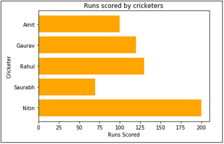
Graph 12 – A horizontal histogram
Keep making irrelevant and unnecessary graphs.
Keep practicing 🙂
XtraMous
The Data Monk services
We are well known for our interview books and have 70+ e-book across Amazon and The Data Monk e-shop page . Following are best-seller combo packs and services that we are providing as of now
- YouTube channel covering all the interview-related important topics in SQL, Python, MS Excel, Machine Learning Algorithm, Statistics, and Direct Interview Questions
Link – The Data Monk Youtube Channel - Website – ~2000 completed solved Interview questions in SQL, Python, ML, and Case Study
Link – The Data Monk website - E-book shop – We have 70+ e-books available on our website and 3 bundles covering 2000+ solved interview questions. Do check it out
Link – The Data E-shop Page - Instagram Page – It covers only Most asked Questions and concepts (100+ posts). We have 100+ most asked interview topics explained in simple terms
Link – The Data Monk Instagram page - Mock Interviews/Career Guidance/Mentorship/Resume Making
Book a slot on Top Mate
The Data Monk e-books
We know that each domain requires a different type of preparation, so we have divided our books in the same way:
1. 2200 Interview Questions to become Full Stack Analytics Professional – 2200 Most Asked Interview Questions
2.Data Scientist and Machine Learning Engineer -> 23 e-books covering all the ML Algorithms Interview Questions
3. 30 Days Analytics Course – Most Asked Interview Questions from 30 crucial topics
You can check out all the other e-books on our e-shop page – Do not miss it
For any information related to courses or e-books, please send an email to nitinkamal132@gmail.com