Piyush was here, I was ready with my cup of tea. I always used to worry about visualizations. For me, most of the visualization work was done by either my Visualization tool or the master of all i.e. MS Excel. Needless to say that I was nervous, because I had tried working on this part multiple times in the past, but have always found a good way to escape.
My past experience with Piyush tells me that either I will get out of this day learning something worthy or else I will never learn to do it this way. I was getting a bit comfortable with Python, so that was a win for me. But the little milestone I was aiming for was right here.
Lost in thoughts, I missed that Piyush was waiting for his Latte, I sipped and sat on the edge of the seat. I did not want him to know that I was nervous, but I guess he must have assumed my condition by this gesture.
‘So, nervous or excited?
‘Umm..nervous, a lot to be frank’
‘Pihu, I have taken multiple Python session, I know people are scared as fuck to visualize things in a programming language. They always find some way to dodge the bullet. But the real beauty of visualization, and by visualization I mean a good informative graph and not something like a simple bar or line chart, is that you can tell a whole story with it’
‘You can substitute a lot of table and a handful of graph with just one graph’
‘That sounds fun’ I couldn’t show mush enthusiasm, but had to nod to show respect to his words.
‘I will start with a question, how or which graph can you use to show the population of each country by continents along with the GDP and life expectancy of each ? This is a classic example of how a graph can exhibit multiple information at one place’ He was looking for at least some sense in my words
‘Well, may be a scatter plot with axis as GDP and Health expectancy !!’ That was quick from my side and I waited for the response.
‘That is close, let me show you’ And he took the laptop from his bag, a silver colored Dell XPS,I used to have the same when I was in college.
‘Just look at the cool graph made by Gapminder’
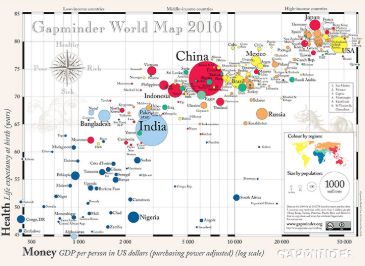
‘Wooooo, that is cool and I must say that I was close’ I was excited
‘This is what a good visualization looks like, you don’t have to make 4 graphs each showing a different data and make it interactive to escape creating this one’
‘Chalo, let’s start with the basics of Python plotting and once we are good to go, we will try creating fancy graphs’
I was a bit excited for the class now, but we only had 40 minutes left and I wanted to make the most out of it.
‘To start with, import the best package available as per now i.e. matplot
import matplotlib.pyplot as plt
‘and now create the first plot, a basic line graph with few data points’
age = (20,30,40,50,60)
wage = (4000,5000,7000,1000,15000)
plt.plot(age,wage)
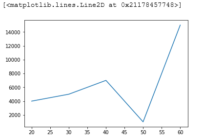
‘Well that was really easy Piyush’ I was elated after creating my first graph within minutes of our class.
‘It’s always hard before you take the first step and the other way round, once you start exploring more. But, this graph is not even close to what we can make. Let’s add some more information to this graph’
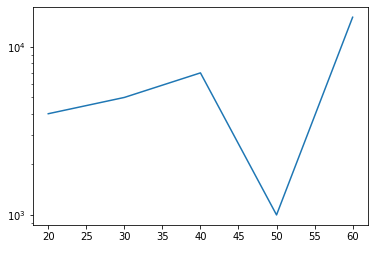
‘Before we move to label and other graphs, do know that if you have numbers or values on your axis in the range of thousands or millions or any large number, then it’s always better to scale your axis, See the way we scale our
age = (20,30,40,50,60)
wage = (4000,5000,7000,1000,15000)
plt.plot(age,wage)
plt.yscale(‘log’)
plt.show()
‘Poor Pihu, now you have to mess up with some awesome histograms’ He chuckled, he knew that I never wanted to create a boring histogram.
‘Ohh, am soo excited’ I said with disappointment pouring down my face.
‘It’s not that bad, See, histogram makes you divide various data points in a bin and thus you can get an idea of the average values, the outliers, and many other things. Do one thing, make a list of 20 random values. I hope you know how to create a list. Do one more thing, create a list of random values by using the random function’ I can see doubts in his eyes
But, I had done my homework, I knew how to import a random package and create a list out of it
import random
my_rand = random.sample(range(1,30),20)
print(my_rand)
print(type(my_rand))
[27, 7, 3, 21, 19, 4, 23, 26, 13, 28, 29, 24, 20, 14, 25, 8, 2, 1, 9, 16]
<class 'list'>
I showed the my_rand list to him and he was happy to say the least.
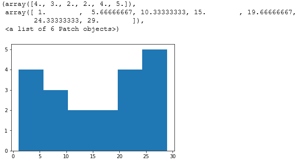
‘This is good Pihu, now just remember the basics that when you want to plot a histogram, you need to have two things, a list with values and the number of bins, you want your histogram to have. See the code below’
plt.hist(my_rand,bins = 6)
‘Pihu, why don’t you label the axis? I have no idea what the x and y-axis is showing’
‘But, I don’t know how to label my graph?’ I had no clue what so ever.
‘In 1998, Larry Page…’
‘Okay
‘Got it, see if I am correct’ It took me 3 minutes to get to the syntax
plt.hist(my_rand,bins = 6)
plt.xlabel(‘Year of Experience’)
plt.ylabel(‘Number of company switch’)
plt.title(‘Year of Exp. vs No. of Company changes ‘)
plt.show()
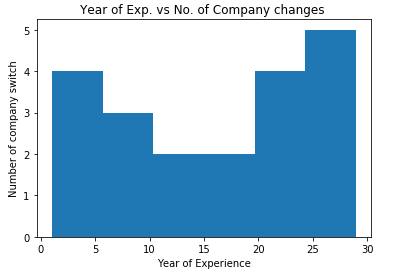
‘The graph is good, but I really liked the labels’ He chuckled.
‘And you provided a graph title as well, good job Pihu’
‘To make the graph more appealing om the axis label part, try the ticks thing’
‘So, a tick actually give
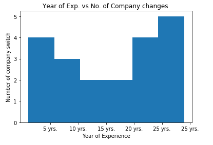
plt.hist(my_rand,bins = 6)
plt.xlabel(‘Year of Experience’)
plt.ylabel(‘Number of company switch’)
plt.title(‘Year of Exp. vs No. of Company changes ‘)
plt.xticks([5,10,15,20,25,30],[‘5 yrs.’,’10 yrs.’,’15 yrs.’,’20 yrs.’,’25 yrs.’,’25 yrs.’,’30 yrs.’])
plt.show()